Design Articles
Learn QR code design best practices, from colors and logos to print-ready formats.
QR code design is more than picking colors. Poor contrast, incorrect logo placement, or the wrong error correction level can leave a QR code that looks great on screen but fails when scanned. The articles here cover color theory for QR codes, logo integration, branded gradients, corner styles, print-ready file formats, and how to balance aesthetics with scanability. Use them to design QR codes that reflect your brand without sacrificing reliability. Every recommendation comes with clear do's and don'ts backed by real-world scanning tests across common phone cameras.

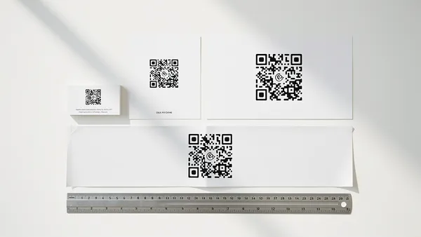
How to Add a QR Code to Your Business Card (2026 Guide)
Best practices for adding QR codes to business cards: sizing, placement, what to link to, and mistakes to avoid.
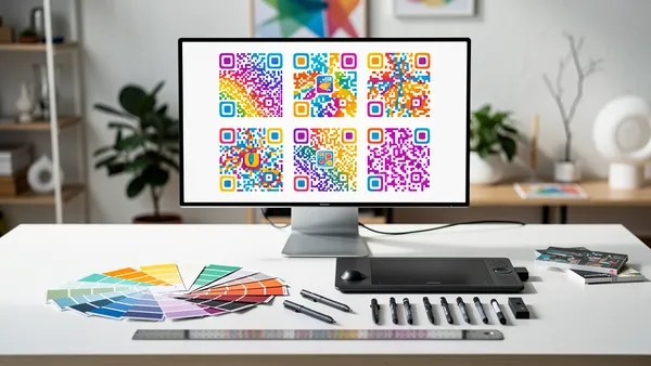
QR Code Design Best Practices for 2026
Learn how to create beautiful, branded QR codes that get scanned. Tips on colors, logos, and maintaining scannability.
QR Code Size Guide: Minimum Sizes for Every Use Case
What size should your QR code be? Covers minimum print dimensions, scanning distance formulas, and real-world examples for cards, posters, and signage.
Browse other categories
Keep exploring the QR code blog. Pick a topic that fits what you are working on next.