The three essential rules for scannable QR code design are: maintain high contrast between foreground and background (dark on light), keep logos under 30% of the code area, and always include a quiet zone border of at least 4 modules. Following these principles ensures your branded QR codes remain functional while looking professional.
The Fundamentals of Scannable Design
Before we dive into creative design options, let's establish the non-negotiables for QR code scannability:
Contrast is Key
The most important factor in QR code scannability is contrast between the foreground (dots) and background. While traditional black on white offers the highest contrast, you can use other color combinations as long as there's sufficient contrast.
Minimum Size Requirements
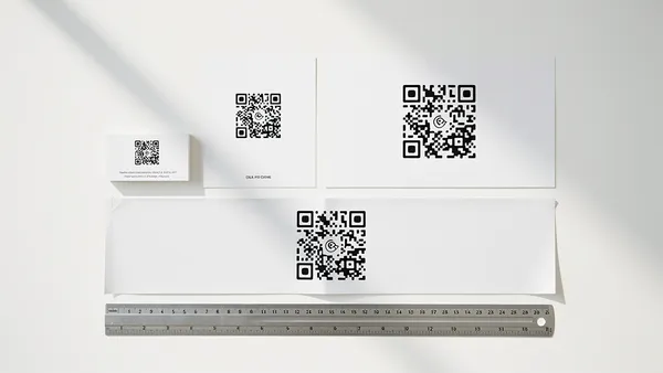
- Business cards: At least 0.8 inches (2 cm)
- Flyers and posters: At least 1.2 inches (3 cm)
- Billboards: Calculate based on scanning distance
The Quiet Zone
Always maintain a white (or light) border around your QR code. This 'quiet zone' should be at least 4 modules wide—about the width of one of the small squares in the code.
Color Best Practices
Do: Use dark colors for the foreground, light colors for the background, test your color combination before printing, and consider how colors will appear in different lighting.
Don't: Use light foreground on dark background (inverted), colors with similar values (low contrast), gradients that reduce contrast, or forget about color blindness accessibility.
Adding Your Logo
One of the most popular customization options is adding a logo to the center of your QR code. Here's how to do it right:
Your logo should cover no more than 30% of the QR code's area. Our system automatically adjusts error correction to compensate for the logo. Use a simplified version of your logo if possible—detailed logos can interfere with scanning. Use a logo with a transparent background, or place it on a white circle to ensure it doesn't blend into the QR pattern.
Pattern and Shape Options
Modern QR codes can use different dot patterns and shapes while remaining scannable: square dots (classic), rounded squares, circular dots, and custom corner styles.
The key is ensuring each 'module' (the smallest unit of the QR code) is clearly distinguishable from its neighbors.
Testing Your Design
Always test your QR code before printing or publishing:
- Test with multiple devices (iPhone, Android)
- Test in different lighting conditions
- Test at the intended scanning distance
- Test a printed version, not just on screen
Common Mistakes to Avoid
- Placing QR codes on reflective surfaces
- Using QR codes on curved surfaces without adjustment
- Printing too small for the scanning distance
- Forgetting to test after design changes
Create your own branded QR code with Quality QR's design tools. Full customization, guaranteed scannability.